Free Statistics

of Irreproducible Research!

Author's title

Author*The author of this computation has been verified*
R Software Modulerwasp_edauni.wasp
Title produced by softwareUnivariate Explorative Data Analysis
Date of computationSat, 25 Oct 2008 14:08:30 -0600
Cite this page as followsStatistical Computations at FreeStatistics.org, Office for Research Development and Education, URL https://freestatistics.org/blog/index.php?v=date/2008/Oct/25/t1224965437rhcvvii8g6drpsm.htm/, Retrieved Sun, 19 May 2024 16:09:21 +0000
Statistical Computations at FreeStatistics.org, Office for Research Development and Education, URL https://freestatistics.org/blog/index.php?pk=18802, Retrieved Sun, 19 May 2024 16:09:21 +0000
QR Codes:

Original text written by user:
IsPrivate?No (this computation is public)
User-defined keywords
Estimated Impact120
Family? (F = Feedback message, R = changed R code, M = changed R Module, P = changed Parameters, D = changed Data)
F     [Univariate Explorative Data Analysis] [Investigation Dis...] [2007-10-21 17:06:37] [b9964c45117f7aac638ab9056d451faa]
F    D    [Univariate Explorative Data Analysis] [Investigating Dis...] [2008-10-25 20:08:30] [4b953869c7238aca4b6e0cfb0c5cddd6] [Current]
Feedback Forum
2008-11-03 22:48:07 [Nick Wuyts] [reply
Assumption 1:
De student baseerde zich op de verkeerde grafiek. Deze assumptie wordt getest door de autocorrelatie of het lagplot.

Grafiek lagplot (k=12) (http://www.freestatistics.org/blog/date/2008/Nov/03/t1225745763h0x6pvq3skjx6ho.htm): we bekomen deze grafieken als je bij het aantal lags 12 invult (een lag is 1 periode vertraagd/teruggaan in de tijd). Op de x-as staat het verleden, de y-as vertoont het heden. We hebben een quasi rechte in de grafiek en de puntenwolk ligt gespreid, dwz de autocorrelatie is dichtbij 0. Correlatie is trouwens een collineariteitsmaatstaf (de mate hoe dicht de punten bij de rechte liggen). Bij deze grafiek zien we dat de punten vrij dicht bij de rechte gelegen zijn, dit geeft een positieve seizoenale autocorrelatie weer (je kan dus voorspellingen doen).

Grafiek autocorrelation function (http://www.freestatistics.org/blog/date/2008/Nov/03/t1225745923mzyuxqjjepnawch.htm): deze grafiek is een samenvatting van de lagplots 1 – 12.
Hierbij kunnen we best het aantal lags op 36 brengen, voor een beter overzicht.
De hoogte van de eerste lijn is correlatie lagplot 1, de 2 horizontale stippellijnen geven het bereik van het 95% interval weer.
Bij lag 12 zien we een heel grote uitschieter, vervolgens bij 24 een iets kleinere en bij 36 een nog kleinere. We stellen vast dat er seizoenale correlatie is en we voorspellingen kunnen doen.

Conclusie: de tijdreeks is niet random, er is een positieve seizoenale autocorrelatie.


Assumption 2:
Hierbij gebruiken we inderdaad het histogram en het density plot (dis is een afgevlakte versie van het histogram & is een normaalverdeling). We lezen bij deze grafieken een normaalverdeling af. Het histogram heeft een piramide-achtige vorm en het density plot een bell-shaped vorm. Ze zijn niet perfect zo, maar dit is niet zorgwekkend.
Een andere manier om tot dezelfde conclusie te komen is het normal Q_Q plot. Bij deze grafiek is te vinden: op de x-as de theoretische kwantielen (als het perfect verdeeld zou zijn) en op de y-as de kwantielen. De punten liggen dicht op/nabij de lijn (= normaalverdeling). Dus er is autocorrelatie.


Assumption 3:
De student heeft de verkeerde grafiek gebruikt. Hiervoor heb ik het run sequence plot (central tendency) gebruikt (http://www.freestatistics.org/blog/date/2008/Nov/03/t12257471304ygbt6ia1ybefhb.htm).
Bij de winsorized mean zien we dat het gemiddelde rond 87 ligt. Het is moeilijk te zien, maar we vermoeden dat er een daling op lange termijn is.


Assumption 4:
Hiervoor gebruiken we ook de run sequence plot We kijken naar de spreiding van de reeks door de tijd heen. De eerste helft is meer gespreid dan de tweede helft. Er is een verandering van de spreiding over de jaren heen.


Besluit:
Er is niet aan alle voorwaarden voldoen dus de tijdreeks voldoet niet helemaal aan het model van: Clothing Production = constant + random component
Vermits er seizoensgebonden correlatie is.

Post a new message
Dataseries X:
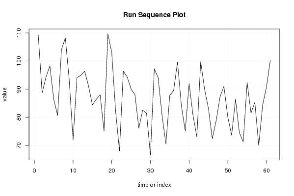
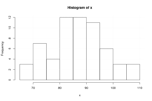
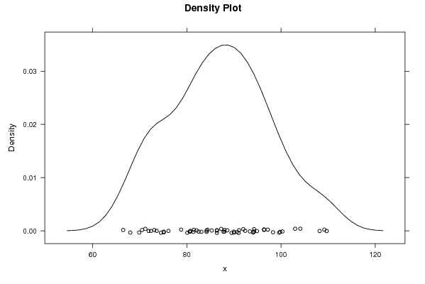
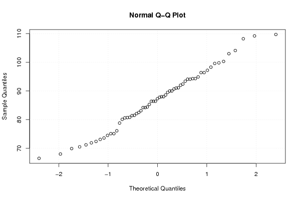
109,20
88,60
94,30
98,30
86,40
80,60
104,10
108,20
93,40
71,90
94,10
94,90
96,40
91,10
84,40
86,40
88,00
75,10
109,70
103,00
82,10
68,00
96,40
94,30
90,00
88,00
76,10
82,50
81,40
66,50
97,20
94,10
80,70
70,50
87,80
89,50
99,60
84,20
75,10
92,00
80,80
73,10
99,80
90,00
83,10
72,40
78,80
87,30
91,00
80,10
73,60
86,40
74,50
71,20
92,40
81,50
85,30
69,90
84,20
90,70
100,30


Summary of computational transaction
Raw Inputview raw input (R code)
Raw Outputview raw output of R engine
Computing time2 seconds
R Server'Gwilym Jenkins' @ 72.249.127.135

\begin{tabular}{lllllllll}
\hline
Summary of computational transaction \tabularnewline
Raw Input & view raw input (R code)  \tabularnewline
Raw Output & view raw output of R engine  \tabularnewline
Computing time & 2 seconds \tabularnewline
R Server & 'Gwilym Jenkins' @ 72.249.127.135 \tabularnewline
\hline
\end{tabular}
%Source: https://freestatistics.org/blog/index.php?pk=18802&T=0

[TABLE]
[ROW][C]Summary of computational transaction[/C][/ROW]
[ROW][C]Raw Input[/C][C]view raw input (R code) [/C][/ROW]
[ROW][C]Raw Output[/C][C]view raw output of R engine [/C][/ROW]
[ROW][C]Computing time[/C][C]2 seconds[/C][/ROW]
[ROW][C]R Server[/C][C]'Gwilym Jenkins' @ 72.249.127.135[/C][/ROW]
[/TABLE]
Source: https://freestatistics.org/blog/index.php?pk=18802&T=0

Globally Unique Identifier (entire table): ba.freestatistics.org/blog/index.php?pk=18802&T=0

As an alternative you can also use a QR Code:  

The GUIDs for individual cells are displayed in the table below:

Summary of computational transaction
Raw Inputview raw input (R code)
Raw Outputview raw output of R engine
Computing time2 seconds
R Server'Gwilym Jenkins' @ 72.249.127.135


Descriptive Statistics
# observations61
minimum66.5
Q180.6
median87.3
mean86.8934426229508
Q394.1
maximum109.7

\begin{tabular}{lllllllll}
\hline
Descriptive Statistics \tabularnewline
# observations & 61 \tabularnewline
minimum & 66.5 \tabularnewline
Q1 & 80.6 \tabularnewline
median & 87.3 \tabularnewline
mean & 86.8934426229508 \tabularnewline
Q3 & 94.1 \tabularnewline
maximum & 109.7 \tabularnewline
\hline
\end{tabular}
%Source: https://freestatistics.org/blog/index.php?pk=18802&T=1

[TABLE]
[ROW][C]Descriptive Statistics[/C][/ROW]
[ROW][C]# observations[/C][C]61[/C][/ROW]
[ROW][C]minimum[/C][C]66.5[/C][/ROW]
[ROW][C]Q1[/C][C]80.6[/C][/ROW]
[ROW][C]median[/C][C]87.3[/C][/ROW]
[ROW][C]mean[/C][C]86.8934426229508[/C][/ROW]
[ROW][C]Q3[/C][C]94.1[/C][/ROW]
[ROW][C]maximum[/C][C]109.7[/C][/ROW]
[/TABLE]
Source: https://freestatistics.org/blog/index.php?pk=18802&T=1

Globally Unique Identifier (entire table): ba.freestatistics.org/blog/index.php?pk=18802&T=1

As an alternative you can also use a QR Code:  

The GUIDs for individual cells are displayed in the table below:

Descriptive Statistics
# observations61
minimum66.5
Q180.6
median87.3
mean86.8934426229508
Q394.1
maximum109.7


Parameters (Session):
par1 = 0 ; par2 = 0 ;
Parameters (R input):
par1 = 0 ; par2 = 0 ; par3 = ; par4 = ; par5 = ; par6 = ; par7 = ; par8 = ; par9 = ; par10 = ; par11 = ; par12 = ; par13 = ; par14 = ; par15 = ; par16 = ; par17 = ; par18 = ; par19 = ; par20 = ;
R code (references can be found in the software module):
par1 <- as.numeric(par1)
par2 <- as.numeric(par2)
x <- as.ts(x)
library(lattice)
bitmap(file='pic1.png')
plot(x,type='l',main='Run Sequence Plot',xlab='time or index',ylab='value')
grid()
dev.off()
bitmap(file='pic2.png')
hist(x)
grid()
dev.off()
bitmap(file='pic3.png')
if (par1 > 0)
{
densityplot(~x,col='black',main=paste('Density Plot bw = ',par1),bw=par1)
} else {
densityplot(~x,col='black',main='Density Plot')
}
dev.off()
bitmap(file='pic4.png')
qqnorm(x)
grid()
dev.off()
if (par2 > 0)
{
bitmap(file='lagplot.png')
dum <- cbind(lag(x,k=1),x)
dum
dum1 <- dum[2:length(x),]
dum1
z <- as.data.frame(dum1)
z
plot(z,main=paste('Lag plot, lowess, and regression line'))
lines(lowess(z))
abline(lm(z))
dev.off()
bitmap(file='pic5.png')
acf(x,lag.max=par2,main='Autocorrelation Function')
grid()
dev.off()
}
summary(x)
load(file='createtable')
a<-table.start()
a<-table.row.start(a)
a<-table.element(a,'Descriptive Statistics',2,TRUE)
a<-table.row.end(a)
a<-table.row.start(a)
a<-table.element(a,'# observations',header=TRUE)
a<-table.element(a,length(x))
a<-table.row.end(a)
a<-table.row.start(a)
a<-table.element(a,'minimum',header=TRUE)
a<-table.element(a,min(x))
a<-table.row.end(a)
a<-table.row.start(a)
a<-table.element(a,'Q1',header=TRUE)
a<-table.element(a,quantile(x,0.25))
a<-table.row.end(a)
a<-table.row.start(a)
a<-table.element(a,'median',header=TRUE)
a<-table.element(a,median(x))
a<-table.row.end(a)
a<-table.row.start(a)
a<-table.element(a,'mean',header=TRUE)
a<-table.element(a,mean(x))
a<-table.row.end(a)
a<-table.row.start(a)
a<-table.element(a,'Q3',header=TRUE)
a<-table.element(a,quantile(x,0.75))
a<-table.row.end(a)
a<-table.row.start(a)
a<-table.element(a,'maximum',header=TRUE)
a<-table.element(a,max(x))
a<-table.row.end(a)
a<-table.end(a)
table.save(a,file='mytable.tab')