Free Statistics

of Irreproducible Research!

Author's title

Author*Unverified author*
R Software Modulerwasp_boxcoxnorm.wasp
Title produced by softwareBox-Cox Normality Plot
Date of computationThu, 13 Nov 2008 15:31:24 -0700
Cite this page as followsStatistical Computations at FreeStatistics.org, Office for Research Development and Education, URL https://freestatistics.org/blog/index.php?v=date/2008/Nov/13/t1226615540f5pavmjr0dvl1n2.htm/, Retrieved Sun, 19 May 2024 11:15:19 +0000
Statistical Computations at FreeStatistics.org, Office for Research Development and Education, URL https://freestatistics.org/blog/index.php?pk=24871, Retrieved Sun, 19 May 2024 11:15:19 +0000
QR Codes:

Original text written by user:
IsPrivate?No (this computation is public)
User-defined keywords
Estimated Impact181
Family? (F = Feedback message, R = changed R code, M = changed R Module, P = changed Parameters, D = changed Data)
-     [Bivariate Kernel Density Estimation] [Bel20 en Downjones] [2008-11-12 17:23:23] [74be16979710d4c4e7c6647856088456]
F RMPD  [Box-Cox Normality Plot] [kelly] [2008-11-12 17:53:57] [74be16979710d4c4e7c6647856088456]
F    D      [Box-Cox Normality Plot] [Box cox normality...] [2008-11-13 22:31:24] [d41d8cd98f00b204e9800998ecf8427e] [Current]
Feedback Forum
2008-11-16 11:31:12 [Nicolaj Wuyts] [reply
Ook hier heeft de Box-Cox linearity plot geen zin. Sterker nog, door de transformatie hier toe te passen, komen de gegevens verder te liggen van de rechte uit de oorsprong.
2008-11-23 13:58:09 [c97d2ae59c98cf77a04815c1edffab5a] [reply
De student heeft de grafieken juist geproduceerd, hij/zij is alleen vergeten de histogrammen ivm de normaalvedeling erbij te zetten. Er is ook geen conclusie gevormd.
allereerst wat uitleg over de box cox normality plot:
Eerst en vooral de Box Cox linearity plot is niet hetzelfde als de Box Cox normality plot. De Box Cox Normality Plot gaat over de distributieverdeling(normaalverdeling) van een variabele.Deze normaalverdeling wil je optimaliseren door een variabele(hier y) te transformeren, door lambda te laten variëren tussen -2 en 2.
Je kan aflezen hoe je de tijdreeks best kan transformeren: met een lambda die de maximum correlatie aanduidt (dit zorgt ervoor dat de verdeling van de tijdreeks meer op een normaalverdeling gaat lijken). De correlatie heeft hier betrekking op de Normal QQ plot.
conclusie ivm deze tijdsreeks:
je kan zien dat, door lambda te laten varieren, en geen maximale correlatie ontstaat waardoor de datareeks meer normaal verdeeld zou zijn. als de student de histogrammen zou hebben weergegeven kon je dit gemakkelijk zien. je kan ook zien dat de correlatie er niet op vooruit is gegaan, omdat de punten verder van de lijn verwijderd zijn.
2008-11-24 10:46:45 [Julian De Ruyter] [reply
Weederom geen conclusie, wel een juiste berekening.
Bij de Box Cox normality plot wordt y getransformeerd om de normaalverdeling te optimaliseren. We gaan lambda tussen 2 en -2 laten verschuiven om een maximum in de functie te bekomen.
De transformatie van de tijdsreeks heeft echter geen verbeterend effect op de normaalverdeling en op de correlatie.
2008-11-24 20:06:29 [Liese Drijkoningen] [reply
De transformatie die werd toegepast heeft geen effect op de variabele. Het verband wordt dus niet verbetert.
2008-11-24 21:10:00 [Jonas Scheltjens] [reply
Q4: De student geeft de normal Q-Q plots en de Box-Cox normality plot. Deze werden echter niet besproken. De Box-Cox normality plot kent hier vloeiende daling, in tegenstelling tot in Q3, waar er sprake was van een stijging. Net zoals in Q3 tracht de lijn in de plot de gegevens in een wetmatigheid te gieten. In deze module wordt getracht na te gaan of de gegevens al dan niet normaal verdeeld zijn. De werking van deze plot is analoog aan deze van de box-cox linearity plot en dus voor meer uitleg kan men kijken bij Q3. uiteraard is er wel een verschil, en dat zit in het feit dat de linearity plot het lineair verband en dat de normality plot de normaal verdeling onderzoekt. Hier zien we wel dat bij de getransformeerde data vloeien naar een horizontale lijn. Ook ziet men dat de sample quartiles drastisch zijn afgenomen in waarden t.o.v. de Q-Q plot bij de originele data. We kunnen dus stellen dat de afwijkingen van de gegevens t.o.v. de rechte veel kleiner is. En dus zie ik hier wel degelijk het nut van de tranformatie.

Post a new message
Dataseries X:
10165
269
708
1362
2271
3516
4775
6334
6150
7794
8851
9721
9676
402
1046
1743
2711
3817
4128
5505
4921
6091
7263
8035
7828
296
500
1134
2061
2737
2959
4113
3494
4518
5470
5664
4717
606
615
1062
983
340
467
1580
804
1709
2335
2832
2582


Summary of computational transaction
Raw Inputview raw input (R code)
Raw Outputview raw output of R engine
Computing time2 seconds
R Server'Gwilym Jenkins' @ 72.249.127.135

\begin{tabular}{lllllllll}
\hline
Summary of computational transaction \tabularnewline
Raw Input & view raw input (R code)  \tabularnewline
Raw Output & view raw output of R engine  \tabularnewline
Computing time & 2 seconds \tabularnewline
R Server & 'Gwilym Jenkins' @ 72.249.127.135 \tabularnewline
\hline
\end{tabular}
%Source: https://freestatistics.org/blog/index.php?pk=24871&T=0

[TABLE]
[ROW][C]Summary of computational transaction[/C][/ROW]
[ROW][C]Raw Input[/C][C]view raw input (R code) [/C][/ROW]
[ROW][C]Raw Output[/C][C]view raw output of R engine [/C][/ROW]
[ROW][C]Computing time[/C][C]2 seconds[/C][/ROW]
[ROW][C]R Server[/C][C]'Gwilym Jenkins' @ 72.249.127.135[/C][/ROW]
[/TABLE]
Source: https://freestatistics.org/blog/index.php?pk=24871&T=0

Globally Unique Identifier (entire table): ba.freestatistics.org/blog/index.php?pk=24871&T=0

As an alternative you can also use a QR Code:  

The GUIDs for individual cells are displayed in the table below:

Summary of computational transaction
Raw Inputview raw input (R code)
Raw Outputview raw output of R engine
Computing time2 seconds
R Server'Gwilym Jenkins' @ 72.249.127.135


Box-Cox Normality Plot
# observations x49
maximum correlation0.0702237585604509
optimal lambda-2

\begin{tabular}{lllllllll}
\hline
Box-Cox Normality Plot \tabularnewline
# observations x & 49 \tabularnewline
maximum correlation & 0.0702237585604509 \tabularnewline
optimal lambda & -2 \tabularnewline
\hline
\end{tabular}
%Source: https://freestatistics.org/blog/index.php?pk=24871&T=1

[TABLE]
[ROW][C]Box-Cox Normality Plot[/C][/ROW]
[ROW][C]# observations x[/C][C]49[/C][/ROW]
[ROW][C]maximum correlation[/C][C]0.0702237585604509[/C][/ROW]
[ROW][C]optimal lambda[/C][C]-2[/C][/ROW]
[/TABLE]
Source: https://freestatistics.org/blog/index.php?pk=24871&T=1

Globally Unique Identifier (entire table): ba.freestatistics.org/blog/index.php?pk=24871&T=1

As an alternative you can also use a QR Code:  

The GUIDs for individual cells are displayed in the table below:

Box-Cox Normality Plot
# observations x49
maximum correlation0.0702237585604509
optimal lambda-2


Parameters (Session):
Parameters (R input):
R code (references can be found in the software module):
n <- length(x)
c <- array(NA,dim=c(401))
l <- array(NA,dim=c(401))
mx <- 0
mxli <- -999
for (i in 1:401)
{
l[i] <- (i-201)/100
if (l[i] != 0)
{
x1 <- (x^l[i] - 1) / l[i]
} else {
x1 <- log(x)
}
c[i] <- cor(qnorm(ppoints(x), mean=0, sd=1),x1)
if (mx < c[i])
{
mx <- c[i]
mxli <- l[i]
}
}
c
mx
mxli
if (mxli != 0)
{
x1 <- (x^mxli - 1) / mxli
} else {
x1 <- log(x)
}
bitmap(file='test1.png')
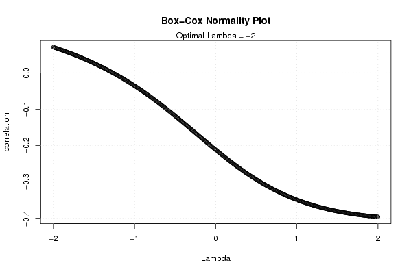
plot(l,c,main='Box-Cox Normality Plot',xlab='Lambda',ylab='correlation')
mtext(paste('Optimal Lambda =',mxli))
grid()
dev.off()
bitmap(file='test2.png')
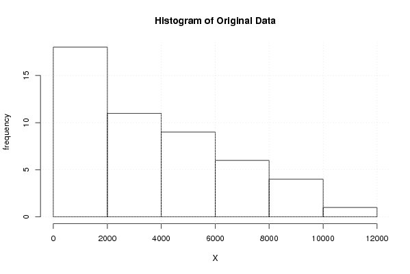
hist(x,main='Histogram of Original Data',xlab='X',ylab='frequency')
grid()
dev.off()
bitmap(file='test3.png')
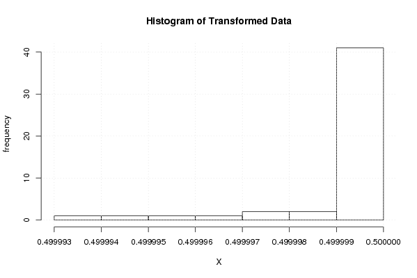
hist(x1,main='Histogram of Transformed Data',xlab='X',ylab='frequency')
grid()
dev.off()
bitmap(file='test4.png')
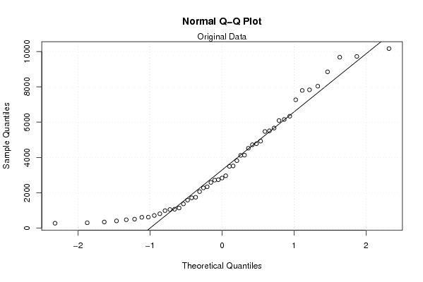
qqnorm(x)
qqline(x)
grid()
mtext('Original Data')
dev.off()
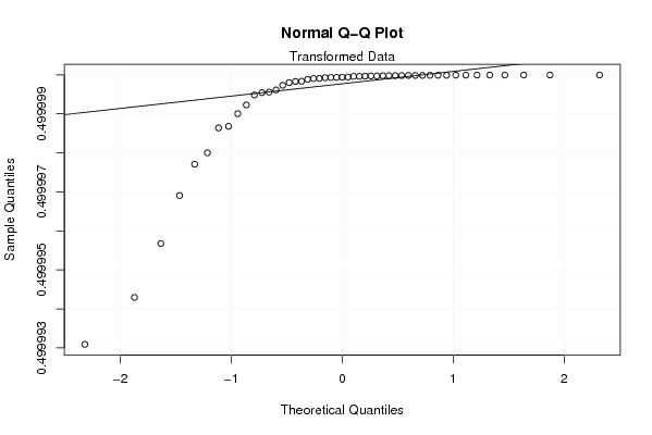
bitmap(file='test5.png')
qqnorm(x1)
qqline(x1)
grid()
mtext('Transformed Data')
dev.off()
load(file='createtable')
a<-table.start()
a<-table.row.start(a)
a<-table.element(a,'Box-Cox Normality Plot',2,TRUE)
a<-table.row.end(a)
a<-table.row.start(a)
a<-table.element(a,'# observations x',header=TRUE)
a<-table.element(a,n)
a<-table.row.end(a)
a<-table.row.start(a)
a<-table.element(a,'maximum correlation',header=TRUE)
a<-table.element(a,mx)
a<-table.row.end(a)
a<-table.row.start(a)
a<-table.element(a,'optimal lambda',header=TRUE)
a<-table.element(a,mxli)
a<-table.row.end(a)
a<-table.end(a)
table.save(a,file='mytable.tab')