Free Statistics
of Irreproducible Research!
Description of Statistical Computation | |||||||||||||||||||||||||||||||||||||||||||||
|---|---|---|---|---|---|---|---|---|---|---|---|---|---|---|---|---|---|---|---|---|---|---|---|---|---|---|---|---|---|---|---|---|---|---|---|---|---|---|---|---|---|---|---|---|---|
| Author's title | |||||||||||||||||||||||||||||||||||||||||||||
| Author | *Unverified author* | ||||||||||||||||||||||||||||||||||||||||||||
| R Software Module | rwasp_bidensity.wasp | ||||||||||||||||||||||||||||||||||||||||||||
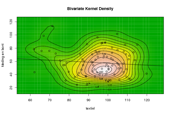
| Title produced by software | Bivariate Kernel Density Estimation | ||||||||||||||||||||||||||||||||||||||||||||
| Date of computation | Wed, 12 Nov 2008 11:31:28 -0700 | ||||||||||||||||||||||||||||||||||||||||||||
| Cite this page as follows | Statistical Computations at FreeStatistics.org, Office for Research Development and Education, URL https://freestatistics.org/blog/index.php?v=date/2008/Nov/12/t1226514711ru5p0xmyyk6etbn.htm/, Retrieved Sun, 19 May 2024 11:38:56 +0000 | ||||||||||||||||||||||||||||||||||||||||||||
| Statistical Computations at FreeStatistics.org, Office for Research Development and Education, URL https://freestatistics.org/blog/index.php?pk=24356, Retrieved Sun, 19 May 2024 11:38:56 +0000 | |||||||||||||||||||||||||||||||||||||||||||||
| QR Codes: | |||||||||||||||||||||||||||||||||||||||||||||
|
| |||||||||||||||||||||||||||||||||||||||||||||
| Original text written by user: | |||||||||||||||||||||||||||||||||||||||||||||
| IsPrivate? | No (this computation is public) | ||||||||||||||||||||||||||||||||||||||||||||
| User-defined keywords | |||||||||||||||||||||||||||||||||||||||||||||
| Estimated Impact | 162 | ||||||||||||||||||||||||||||||||||||||||||||
Tree of Dependent Computations | |||||||||||||||||||||||||||||||||||||||||||||
| Family? (F = Feedback message, R = changed R code, M = changed R Module, P = changed Parameters, D = changed Data) | |||||||||||||||||||||||||||||||||||||||||||||
| F [Bivariate Kernel Density Estimation] [bivariate density] [2008-11-12 18:31:28] [e209dec8b43e229a9358ea9eca132ee0] [Current] | |||||||||||||||||||||||||||||||||||||||||||||
| Feedback Forum | |||||||||||||||||||||||||||||||||||||||||||||
Post a new message | |||||||||||||||||||||||||||||||||||||||||||||
Dataset | |||||||||||||||||||||||||||||||||||||||||||||
| Dataseries X: | |||||||||||||||||||||||||||||||||||||||||||||
62,2 88,5 93,3 89,2 101,3 97 102,2 100,3 78,2 105,9 119,9 108 77 93,1 109,5 100,4 99 113,9 102,1 101,6 84 110,7 111,6 110,7 73,1 87,5 109,6 99,3 92,1 109,3 94,5 91,4 82,9 103,3 96 104,8 65,8 78,7 100,3 85 94,5 97,9 91,9 87,2 84,4 99,2 105,4 110,9 69,8 86,8 106,7 88,8 96,9 108,1 93,7 94,8 79,8 95,6 107,9 104,9 61,9 85,7 92,4 86,4 99,3 95,5 97 102,1 77,8 105,5 113,2 108,8 66,9 89,3 93,6 92 99,5 98,6 94,6 96,7 75,3 102,5 115,1 104,7 71,4 | |||||||||||||||||||||||||||||||||||||||||||||
| Dataseries Y: | |||||||||||||||||||||||||||||||||||||||||||||
43,5 37,7 36,8 24,4 31,3 43,9 53,6 48,9 30,9 31,8 41,3 43,7 54,1 47,8 36,7 30,8 31,9 61,7 73 64,7 24,2 33,9 32,4 63,2 71,8 60,4 48 44,5 44,9 70,9 72,7 59,5 35,9 40 43,6 57,2 75,8 57,7 47,7 42,3 43 68 70,6 54,2 38,6 40,3 49,2 68,5 75,9 63,2 49,8 37 48,8 74,9 75,3 66,9 44,1 39,8 56,6 77,1 78,5 70,6 54,2 47,2 55,1 74,5 88 80,8 54,4 55,2 73,8 85,3 98,7 86,1 62,5 58,6 67 88,4 96,5 87,1 61,2 62,5 85,2 101,7 113,7 | |||||||||||||||||||||||||||||||||||||||||||||
Tables (Output of Computation) | |||||||||||||||||||||||||||||||||||||||||||||
| |||||||||||||||||||||||||||||||||||||||||||||
Figures (Output of Computation) | |||||||||||||||||||||||||||||||||||||||||||||
Input Parameters & R Code | |||||||||||||||||||||||||||||||||||||||||||||
| Parameters (Session): | |||||||||||||||||||||||||||||||||||||||||||||
| par1 = 50 ; par2 = 50 ; par3 = 0 ; par4 = 0 ; par5 = 0 ; par6 = Y ; par7 = Y ; | |||||||||||||||||||||||||||||||||||||||||||||
| Parameters (R input): | |||||||||||||||||||||||||||||||||||||||||||||
| par1 = 50 ; par2 = 50 ; par3 = 0 ; par4 = 0 ; par5 = 0 ; par6 = Y ; par7 = Y ; | |||||||||||||||||||||||||||||||||||||||||||||
| R code (references can be found in the software module): | |||||||||||||||||||||||||||||||||||||||||||||
par1 <- as(par1,'numeric') | |||||||||||||||||||||||||||||||||||||||||||||