Free Statistics
of Irreproducible Research!
Description of Statistical Computation | |||||||||||||||||||||||||||||||||||||||||||||
|---|---|---|---|---|---|---|---|---|---|---|---|---|---|---|---|---|---|---|---|---|---|---|---|---|---|---|---|---|---|---|---|---|---|---|---|---|---|---|---|---|---|---|---|---|---|
| Author's title | |||||||||||||||||||||||||||||||||||||||||||||
| Author | *The author of this computation has been verified* | ||||||||||||||||||||||||||||||||||||||||||||
| R Software Module | rwasp_bidensity.wasp | ||||||||||||||||||||||||||||||||||||||||||||
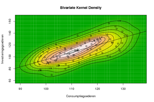
| Title produced by software | Bivariate Kernel Density Estimation | ||||||||||||||||||||||||||||||||||||||||||||
| Date of computation | Wed, 12 Nov 2008 07:49:29 -0700 | ||||||||||||||||||||||||||||||||||||||||||||
| Cite this page as follows | Statistical Computations at FreeStatistics.org, Office for Research Development and Education, URL https://freestatistics.org/blog/index.php?v=date/2008/Nov/12/t1226501431wm765jlatm35eo8.htm/, Retrieved Sun, 19 May 2024 09:37:38 +0000 | ||||||||||||||||||||||||||||||||||||||||||||
| Statistical Computations at FreeStatistics.org, Office for Research Development and Education, URL https://freestatistics.org/blog/index.php?pk=24219, Retrieved Sun, 19 May 2024 09:37:38 +0000 | |||||||||||||||||||||||||||||||||||||||||||||
| QR Codes: | |||||||||||||||||||||||||||||||||||||||||||||
|
| |||||||||||||||||||||||||||||||||||||||||||||
| Original text written by user: | |||||||||||||||||||||||||||||||||||||||||||||
| IsPrivate? | No (this computation is public) | ||||||||||||||||||||||||||||||||||||||||||||
| User-defined keywords | |||||||||||||||||||||||||||||||||||||||||||||
| Estimated Impact | 153 | ||||||||||||||||||||||||||||||||||||||||||||
Tree of Dependent Computations | |||||||||||||||||||||||||||||||||||||||||||||
| Family? (F = Feedback message, R = changed R code, M = changed R Module, P = changed Parameters, D = changed Data) | |||||||||||||||||||||||||||||||||||||||||||||
| F [Bivariate Kernel Density Estimation] [various eda topic...] [2008-11-12 14:49:29] [e7b1048c2c3a353441b9143db4404b91] [Current] | |||||||||||||||||||||||||||||||||||||||||||||
| Feedback Forum | |||||||||||||||||||||||||||||||||||||||||||||
Post a new message | |||||||||||||||||||||||||||||||||||||||||||||
Dataset | |||||||||||||||||||||||||||||||||||||||||||||
| Dataseries X: | |||||||||||||||||||||||||||||||||||||||||||||
97,8 107,4 117,5 105,6 97,4 99,5 98,0 104,3 100,6 101,1 103,9 96,9 95,5 108,4 117,0 103,8 100,8 110,6 104,0 112,6 107,3 98,9 109,8 104,9 102,2 123,9 124,9 112,7 121,9 100,6 104,3 120,4 107,5 102,9 125,6 107,5 108,8 128,4 121,1 119,5 128,7 108,7 105,5 119,8 111,3 110,6 120,1 97,5 107,7 127,3 117,2 119,8 116,2 111,0 112,4 130,6 109,1 118,8 123,9 101,6 112,8 128,0 129,6 125,8 119,5 115,7 113,6 129,7 112,0 116,8 127,0 112,1 114,2 121,1 131,6 125,0 120,4 117,7 117,5 120,6 127,5 112,3 124,5 115,2 105,4 | |||||||||||||||||||||||||||||||||||||||||||||
| Dataseries Y: | |||||||||||||||||||||||||||||||||||||||||||||
78,4 114,6 113,3 117,0 99,6 99,4 101,9 115,2 108,5 113,8 121,0 92,2 90,2 101,5 126,6 93,9 89,8 93,4 101,5 110,4 105,9 108,4 113,9 86,1 69,4 101,2 100,5 98,0 106,6 90,1 96,9 125,9 112,0 100,0 123,9 79,8 83,4 113,6 112,9 104,0 109,9 99,0 106,3 128,9 111,1 102,9 130,0 87,0 87,5 117,6 103,4 110,8 112,6 102,5 112,4 135,6 105,1 127,7 137,0 91,0 90,5 122,4 123,3 124,3 120,0 118,1 119,0 142,7 123,6 129,6 151,6 110,4 99,2 130,5 136,2 129,7 128,0 121,6 135,8 143,8 147,5 136,2 156,6 123,3 100,4 | |||||||||||||||||||||||||||||||||||||||||||||
Tables (Output of Computation) | |||||||||||||||||||||||||||||||||||||||||||||
| |||||||||||||||||||||||||||||||||||||||||||||
Figures (Output of Computation) | |||||||||||||||||||||||||||||||||||||||||||||
Input Parameters & R Code | |||||||||||||||||||||||||||||||||||||||||||||
| Parameters (Session): | |||||||||||||||||||||||||||||||||||||||||||||
| par1 = 50 ; par2 = 50 ; par3 = 0 ; par4 = 0 ; par5 = 0 ; par6 = Y ; par7 = Y ; | |||||||||||||||||||||||||||||||||||||||||||||
| Parameters (R input): | |||||||||||||||||||||||||||||||||||||||||||||
| par1 = 50 ; par2 = 50 ; par3 = 0 ; par4 = 0 ; par5 = 0 ; par6 = Y ; par7 = Y ; | |||||||||||||||||||||||||||||||||||||||||||||
| R code (references can be found in the software module): | |||||||||||||||||||||||||||||||||||||||||||||
par1 <- as(par1,'numeric') | |||||||||||||||||||||||||||||||||||||||||||||