Free Statistics
of Irreproducible Research!
Description of Statistical Computation | |||||||||||||||||||||||||||||||||||||||||||||
|---|---|---|---|---|---|---|---|---|---|---|---|---|---|---|---|---|---|---|---|---|---|---|---|---|---|---|---|---|---|---|---|---|---|---|---|---|---|---|---|---|---|---|---|---|---|
| Author's title | |||||||||||||||||||||||||||||||||||||||||||||
| Author | *Unverified author* | ||||||||||||||||||||||||||||||||||||||||||||
| R Software Module | rwasp_bidensity.wasp | ||||||||||||||||||||||||||||||||||||||||||||
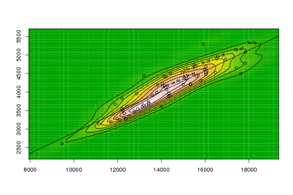
| Title produced by software | Bivariate Kernel Density Estimation | ||||||||||||||||||||||||||||||||||||||||||||
| Date of computation | Tue, 11 Nov 2008 12:28:24 -0700 | ||||||||||||||||||||||||||||||||||||||||||||
| Cite this page as follows | Statistical Computations at FreeStatistics.org, Office for Research Development and Education, URL https://freestatistics.org/blog/index.php?v=date/2008/Nov/11/t1226431786o8ybn0al5vzpyur.htm/, Retrieved Wed, 02 Jul 2025 05:02:03 +0000 | ||||||||||||||||||||||||||||||||||||||||||||
| Statistical Computations at FreeStatistics.org, Office for Research Development and Education, URL https://freestatistics.org/blog/index.php?pk=23872, Retrieved Wed, 02 Jul 2025 05:02:03 +0000 | |||||||||||||||||||||||||||||||||||||||||||||
| QR Codes: | |||||||||||||||||||||||||||||||||||||||||||||
|
| |||||||||||||||||||||||||||||||||||||||||||||
| Original text written by user: | |||||||||||||||||||||||||||||||||||||||||||||
| IsPrivate? | No (this computation is public) | ||||||||||||||||||||||||||||||||||||||||||||
| User-defined keywords | |||||||||||||||||||||||||||||||||||||||||||||
| Estimated Impact | 226 | ||||||||||||||||||||||||||||||||||||||||||||
Tree of Dependent Computations | |||||||||||||||||||||||||||||||||||||||||||||
| Family? (F = Feedback message, R = changed R code, M = changed R Module, P = changed Parameters, D = changed Data) | |||||||||||||||||||||||||||||||||||||||||||||
| F [Bivariate Kernel Density Estimation] [Various EDA topic...] [2008-11-04 19:00:29] [077ffec662d24c06be4c491541a44245] F [Bivariate Kernel Density Estimation] [Bivariate Kernel ...] [2008-11-11 15:54:56] [73d6180dc45497329efd1b6934a84aba] F [Bivariate Kernel Density Estimation] [Bivariate Density] [2008-11-11 17:20:05] [6816386b1f3c2f6c0c9f2aa1e5bc9362] F [Bivariate Kernel Density Estimation] [Q1 bivariate kernel] [2008-11-11 19:28:24] [81dc0ee785f23261ccd6abf7aef76c2a] [Current] | |||||||||||||||||||||||||||||||||||||||||||||
| Feedback Forum | |||||||||||||||||||||||||||||||||||||||||||||
Post a new message | |||||||||||||||||||||||||||||||||||||||||||||
Dataset | |||||||||||||||||||||||||||||||||||||||||||||
| Dataseries X: | |||||||||||||||||||||||||||||||||||||||||||||
12300.00 12092.80 12380.80 12196.90 9455.00 13168.00 13427.90 11980.50 11884.80 11691.70 12233.80 14341.40 13130.70 12421.10 14285.80 12864.60 11160.20 14316.20 14388.70 14013.90 13419.00 12769.60 13315.50 15332.90 14243.00 13824.40 14962.90 13202.90 12199.00 15508.90 14199.80 15169.60 14058.00 13786.20 14147.90 16541.70 13587.50 15582.40 15802.80 14130.50 12923.20 15612.20 16033.70 16036.60 14037.80 15330.60 15038.30 17401.80 14992.50 16043.70 16929.60 15921.30 14417.20 15961.00 17851.90 16483.90 14215.50 17429.70 17839.50 17629.20 | |||||||||||||||||||||||||||||||||||||||||||||
| Dataseries Y: | |||||||||||||||||||||||||||||||||||||||||||||
3423.40 3242.80 3277.20 3833.00 2606.30 3643.80 3686.40 3281.60 3669.30 3191.50 3512.70 3970.70 3601.20 3610.00 4172.10 3956.20 3142.70 3884.30 3892.20 3613.00 3730.50 3481.30 3649.50 4215.20 4066.60 4196.80 4536.60 4441.60 3548.30 4735.90 4130.60 4356.20 4159.60 3988.00 4167.80 4902.20 3909.40 4697.60 4308.90 4420.40 3544.20 4433.00 4479.70 4533.20 4237.50 4207.40 4394.00 5148.40 4202.20 4682.50 4884.30 5288.90 4505.20 4611.50 5081.10 4523.10 4412.80 4647.40 4778.60 4495.30 | |||||||||||||||||||||||||||||||||||||||||||||
Tables (Output of Computation) | |||||||||||||||||||||||||||||||||||||||||||||
| |||||||||||||||||||||||||||||||||||||||||||||
Figures (Output of Computation) | |||||||||||||||||||||||||||||||||||||||||||||
Input Parameters & R Code | |||||||||||||||||||||||||||||||||||||||||||||
| Parameters (Session): | |||||||||||||||||||||||||||||||||||||||||||||
| par1 = 50 ; par2 = 50 ; par3 = 0 ; par4 = 0 ; par5 = 0 ; par6 = Y ; par7 = Y ; | |||||||||||||||||||||||||||||||||||||||||||||
| Parameters (R input): | |||||||||||||||||||||||||||||||||||||||||||||
| par1 = 50 ; par2 = 50 ; par3 = 0 ; par4 = 0 ; par5 = 0 ; par6 = Y ; par7 = Y ; par8 = ; par9 = ; par10 = ; par11 = ; par12 = ; par13 = ; par14 = ; par15 = ; par16 = ; par17 = ; par18 = ; par19 = ; par20 = ; | |||||||||||||||||||||||||||||||||||||||||||||
| R code (references can be found in the software module): | |||||||||||||||||||||||||||||||||||||||||||||
par1 <- as(par1,'numeric') | |||||||||||||||||||||||||||||||||||||||||||||