Free Statistics

of Irreproducible Research!

Author's title

Author*The author of this computation has been verified*
R Software Modulerwasp_bidensity.wasp
Title produced by softwareBivariate Kernel Density Estimation
Date of computationTue, 11 Nov 2008 11:54:11 -0700
Cite this page as followsStatistical Computations at FreeStatistics.org, Office for Research Development and Education, URL https://freestatistics.org/blog/index.php?v=date/2008/Nov/11/t1226429757bauelrwq5o3dxpu.htm/, Retrieved Sun, 19 May 2024 12:42:03 +0000
Statistical Computations at FreeStatistics.org, Office for Research Development and Education, URL https://freestatistics.org/blog/index.php?pk=23830, Retrieved Sun, 19 May 2024 12:42:03 +0000
QR Codes:

Original text written by user:
IsPrivate?No (this computation is public)
User-defined keywords
Estimated Impact116
Family? (F = Feedback message, R = changed R code, M = changed R Module, P = changed Parameters, D = changed Data)
F       [Bivariate Kernel Density Estimation] [q1] [2008-11-11 18:54:11] [f24298b2e4c2a19d76cf4460ec5d2246] [Current]
Feedback Forum
2008-11-21 16:07:07 [Stijn Van de Velde] [reply
Dit is de oplossing voor de nadelen van de Trivariate Scatterplot. Daar word namelijk gebruik gemaakt van een 3D tekening, maar doordat ons scherm maar 2D is kan dat een zeer vertekend beeld opleveren.

Deze grafiek vermijd dat probleem door te werken met hoogtelijnen. De hoogste punten, die waar de dichtheid van de data het grootste is, krijgen dan een wit/roze kleur. De groene kleuren duiden op gebieden zonder enige dichtheid.

Je kan zien dat de punten grotendeels op een rechte liggen, wat op een positief lineair verband duid. De gegeven behoren voornamelijk bij 1 cluster, maar is ook duidelijk een 2de clustertje zichtbaar.
2008-11-24 11:35:04 [Lindsay Heyndrickx] [reply
Hier werd geen uitleg bij gegeven.
Met deze grafiek kan je punten op gelijke dichtheid meten. De derde dimensie wordt hier getekend met hoogtelijnen. Je ziet hier twee clusters de samenhang van deze clusters geeft het positieve verband tussen de reeksen weer. Als er een grote dichtheid is van de punten is de waarschijnlijkheid groot dat er veel observaties zijn. Hier worden ook de betrouwbaarheidsintervallen in kaart gebracht
2008-11-24 18:18:15 [Jeroen Aerts] [reply
Door te werken met hoogtelijnen vermijd je het nadeel van de trivariate density plot waar een 3D-figuur op een 2D-scherm voor verwarring zorgt.

De punten die hier toch wel erg goed zichtbaar op de rechte liggen is er een positief lineair verband vast te stellen. Daar bevindt zich de grootste cluster, er is er ook nog een kleintje zichtbaar links boven de rechte.

Post a new message
Dataseries X:
88.6
71.6
93.3
84.3
80.6
75.2
69.7
82
69.4
83.3
79.6
82.6
80.6
83.5
76.3
Dataseries Y:
20
16
19.8
18.4
17.1
15.5
14.7
17.1
15.4
16.2
15
17.2
16
17
14.4


Summary of computational transaction
Raw Inputview raw input (R code)
Raw Outputview raw output of R engine
Computing time2 seconds
R Server'Sir Ronald Aylmer Fisher' @ 193.190.124.24

\begin{tabular}{lllllllll}
\hline
Summary of computational transaction \tabularnewline
Raw Input & view raw input (R code)  \tabularnewline
Raw Output & view raw output of R engine  \tabularnewline
Computing time & 2 seconds \tabularnewline
R Server & 'Sir Ronald Aylmer Fisher' @ 193.190.124.24 \tabularnewline
\hline
\end{tabular}
%Source: https://freestatistics.org/blog/index.php?pk=23830&T=0

[TABLE]
[ROW][C]Summary of computational transaction[/C][/ROW]
[ROW][C]Raw Input[/C][C]view raw input (R code) [/C][/ROW]
[ROW][C]Raw Output[/C][C]view raw output of R engine [/C][/ROW]
[ROW][C]Computing time[/C][C]2 seconds[/C][/ROW]
[ROW][C]R Server[/C][C]'Sir Ronald Aylmer Fisher' @ 193.190.124.24[/C][/ROW]
[/TABLE]
Source: https://freestatistics.org/blog/index.php?pk=23830&T=0

Globally Unique Identifier (entire table): ba.freestatistics.org/blog/index.php?pk=23830&T=0

As an alternative you can also use a QR Code:  

The GUIDs for individual cells are displayed in the table below:

Summary of computational transaction
Raw Inputview raw input (R code)
Raw Outputview raw output of R engine
Computing time2 seconds
R Server'Sir Ronald Aylmer Fisher' @ 193.190.124.24


Bandwidth
x axis2.94405258805187
y axis0.844180110906567
Correlation
correlation used in KDE0.835143786782374
correlation(x,y)0.835143786782374

\begin{tabular}{lllllllll}
\hline
Bandwidth \tabularnewline
x axis & 2.94405258805187 \tabularnewline
y axis & 0.844180110906567 \tabularnewline
Correlation \tabularnewline
correlation used in KDE & 0.835143786782374 \tabularnewline
correlation(x,y) & 0.835143786782374 \tabularnewline
\hline
\end{tabular}
%Source: https://freestatistics.org/blog/index.php?pk=23830&T=1

[TABLE]
[ROW][C]Bandwidth[/C][/ROW]
[ROW][C]x axis[/C][C]2.94405258805187[/C][/ROW]
[ROW][C]y axis[/C][C]0.844180110906567[/C][/ROW]
[ROW][C]Correlation[/C][/ROW]
[ROW][C]correlation used in KDE[/C][C]0.835143786782374[/C][/ROW]
[ROW][C]correlation(x,y)[/C][C]0.835143786782374[/C][/ROW]
[/TABLE]
Source: https://freestatistics.org/blog/index.php?pk=23830&T=1

Globally Unique Identifier (entire table): ba.freestatistics.org/blog/index.php?pk=23830&T=1

As an alternative you can also use a QR Code:  

The GUIDs for individual cells are displayed in the table below:

Bandwidth
x axis2.94405258805187
y axis0.844180110906567
Correlation
correlation used in KDE0.835143786782374
correlation(x,y)0.835143786782374


Parameters (Session):
par1 = 50 ; par2 = 50 ; par3 = 0 ; par4 = 0 ; par5 = 0 ; par6 = Y ; par7 = Y ;
Parameters (R input):
par1 = 50 ; par2 = 50 ; par3 = 0 ; par4 = 0 ; par5 = 0 ; par6 = Y ; par7 = Y ;
R code (references can be found in the software module):
par1 <- as(par1,'numeric')
par2 <- as(par2,'numeric')
par3 <- as(par3,'numeric')
par4 <- as(par4,'numeric')
par5 <- as(par5,'numeric')
library('GenKern')
if (par3==0) par3 <- dpik(x)
if (par4==0) par4 <- dpik(y)
if (par5==0) par5 <- cor(x,y)
if (par1 > 500) par1 <- 500
if (par2 > 500) par2 <- 500
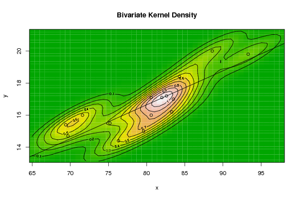
bitmap(file='bidensity.png')
op <- KernSur(x,y, xgridsize=par1, ygridsize=par2, correlation=par5, xbandwidth=par3, ybandwidth=par4)
image(op$xords, op$yords, op$zden, col=terrain.colors(100), axes=TRUE,main=main,xlab=xlab,ylab=ylab)
if (par6=='Y') contour(op$xords, op$yords, op$zden, add=TRUE)
if (par7=='Y') points(x,y)
(r<-lm(y ~ x))
abline(r)
box()
dev.off()
load(file='createtable')
a<-table.start()
a<-table.row.start(a)
a<-table.element(a,'Bandwidth',2,TRUE)
a<-table.row.end(a)
a<-table.row.start(a)
a<-table.element(a,'x axis',header=TRUE)
a<-table.element(a,par3)
a<-table.row.end(a)
a<-table.row.start(a)
a<-table.element(a,'y axis',header=TRUE)
a<-table.element(a,par4)
a<-table.row.end(a)
a<-table.row.start(a)
a<-table.element(a,'Correlation',2,TRUE)
a<-table.row.end(a)
a<-table.row.start(a)
a<-table.element(a,'correlation used in KDE',header=TRUE)
a<-table.element(a,par5)
a<-table.row.end(a)
a<-table.row.start(a)
a<-table.element(a,'correlation(x,y)',header=TRUE)
a<-table.element(a,cor(x,y))
a<-table.row.end(a)
a<-table.end(a)
table.save(a,file='mytable.tab')