Free Statistics
of Irreproducible Research!
Description of Statistical Computation | |||||||||||||||||||||||||||||||||||||||||||||
|---|---|---|---|---|---|---|---|---|---|---|---|---|---|---|---|---|---|---|---|---|---|---|---|---|---|---|---|---|---|---|---|---|---|---|---|---|---|---|---|---|---|---|---|---|---|
| Author's title | |||||||||||||||||||||||||||||||||||||||||||||
| Author | *Unverified author* | ||||||||||||||||||||||||||||||||||||||||||||
| R Software Module | rwasp_bidensity.wasp | ||||||||||||||||||||||||||||||||||||||||||||
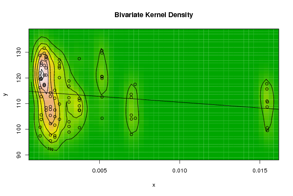
| Title produced by software | Bivariate Kernel Density Estimation | ||||||||||||||||||||||||||||||||||||||||||||
| Date of computation | Tue, 11 Nov 2008 04:26:03 -0700 | ||||||||||||||||||||||||||||||||||||||||||||
| Cite this page as follows | Statistical Computations at FreeStatistics.org, Office for Research Development and Education, URL https://freestatistics.org/blog/index.php?v=date/2008/Nov/11/t1226402831jfojx6mu9ugj3x4.htm/, Retrieved Sun, 19 May 2024 08:51:25 +0000 | ||||||||||||||||||||||||||||||||||||||||||||
| Statistical Computations at FreeStatistics.org, Office for Research Development and Education, URL https://freestatistics.org/blog/index.php?pk=23328, Retrieved Sun, 19 May 2024 08:51:25 +0000 | |||||||||||||||||||||||||||||||||||||||||||||
| QR Codes: | |||||||||||||||||||||||||||||||||||||||||||||
|
| |||||||||||||||||||||||||||||||||||||||||||||
| Original text written by user: | |||||||||||||||||||||||||||||||||||||||||||||
| IsPrivate? | No (this computation is public) | ||||||||||||||||||||||||||||||||||||||||||||
| User-defined keywords | |||||||||||||||||||||||||||||||||||||||||||||
| Estimated Impact | 130 | ||||||||||||||||||||||||||||||||||||||||||||
Tree of Dependent Computations | |||||||||||||||||||||||||||||||||||||||||||||
| Family? (F = Feedback message, R = changed R code, M = changed R Module, P = changed Parameters, D = changed Data) | |||||||||||||||||||||||||||||||||||||||||||||
| F [Bivariate Kernel Density Estimation] [8.3 various EDA T...] [2008-11-11 11:26:03] [0cebda6bbc99948f606f5db2560512ab] [Current] | |||||||||||||||||||||||||||||||||||||||||||||
| Feedback Forum | |||||||||||||||||||||||||||||||||||||||||||||
Post a new message | |||||||||||||||||||||||||||||||||||||||||||||
Dataset | |||||||||||||||||||||||||||||||||||||||||||||
| Dataseries X: | |||||||||||||||||||||||||||||||||||||||||||||
31/08/2001 30/09/2001 31/10/2001 30/11/2001 31/12/2001 31/01/2002 28/02/2002 31/03/2002 30/04/2002 31/05/2002 30/06/2002 31/07/2002 31/08/2002 30/09/2002 31/10/2002 30/11/2002 31/12/2002 31/01/2003 28/02/2003 31/03/2003 30/04/2003 31/05/2003 30/06/2003 31/07/2003 31/08/2003 30/09/2003 31/10/2003 30/11/2003 31/12/2003 31/01/2004 29/02/2004 31/03/2004 30/04/2004 31/05/2004 30/06/2004 31/07/2004 31/08/2004 30/09/2004 31/10/2004 30/11/2004 31/12/2004 31/01/2005 28/02/2005 31/03/2005 30/04/2005 31/05/2005 30/06/2005 31/07/2005 31/08/2005 30/09/2005 31/10/2005 30/11/2005 31/12/2005 31/01/2006 28/02/2006 31/03/2006 30/04/2006 31/05/2006 30/06/2006 31/07/2006 31/08/2006 30/09/2006 31/10/2006 30/11/2006 31/12/2006 31/01/2007 28/02/2007 31/03/2007 30/04/2007 31/05/2007 30/06/2007 31/07/2007 31/08/2007 30/09/2007 31/10/2007 30/11/2007 31/12/2007 31/01/2008 29/02/2008 31/03/2008 30/04/2008 31/05/2008 30/06/2008 31/07/2008 31/08/2008 | |||||||||||||||||||||||||||||||||||||||||||||
| Dataseries Y: | |||||||||||||||||||||||||||||||||||||||||||||
97,8 107,4 117,5 105,6 97,4 99,5 98 104,3 100,6 101,1 103,9 96,9 95,5 108,4 117 103,8 100,8 110,6 104 112,6 107,3 98,9 109,8 104,9 102,2 123,9 124,9 112,7 121,9 100,6 104,3 120,4 107,5 102,9 125,6 107,5 108,8 128,4 121,1 119,5 128,7 108,7 105,5 119,8 111,3 110,6 120,1 97,5 107,7 127,3 117,2 119,8 116,2 111 112,4 130,6 109,1 118,8 123,9 101,6 112,8 128 129,6 125,8 119,5 115,7 113,6 129,7 112 116,8 127 112,1 114,2 121,1 131,6 125 120,4 117,7 117,5 120,6 127,5 112,3 124,5 115,2 105,4 | |||||||||||||||||||||||||||||||||||||||||||||
Tables (Output of Computation) | |||||||||||||||||||||||||||||||||||||||||||||
| |||||||||||||||||||||||||||||||||||||||||||||
Figures (Output of Computation) | |||||||||||||||||||||||||||||||||||||||||||||
Input Parameters & R Code | |||||||||||||||||||||||||||||||||||||||||||||
| Parameters (Session): | |||||||||||||||||||||||||||||||||||||||||||||
| par1 = 50 ; par2 = 50 ; par3 = 0 ; par4 = 0 ; par5 = 0 ; par6 = Y ; par7 = Y ; | |||||||||||||||||||||||||||||||||||||||||||||
| Parameters (R input): | |||||||||||||||||||||||||||||||||||||||||||||
| par1 = 50 ; par2 = 50 ; par3 = 0 ; par4 = 0 ; par5 = 0 ; par6 = Y ; par7 = Y ; | |||||||||||||||||||||||||||||||||||||||||||||
| R code (references can be found in the software module): | |||||||||||||||||||||||||||||||||||||||||||||
par1 <- as(par1,'numeric') | |||||||||||||||||||||||||||||||||||||||||||||