Free Statistics
of Irreproducible Research!
Description of Statistical Computation | |||||||||||||||||||||||||||||||||||||||||||||
|---|---|---|---|---|---|---|---|---|---|---|---|---|---|---|---|---|---|---|---|---|---|---|---|---|---|---|---|---|---|---|---|---|---|---|---|---|---|---|---|---|---|---|---|---|---|
| Author's title | |||||||||||||||||||||||||||||||||||||||||||||
| Author | *The author of this computation has been verified* | ||||||||||||||||||||||||||||||||||||||||||||
| R Software Module | rwasp_bidensity.wasp | ||||||||||||||||||||||||||||||||||||||||||||
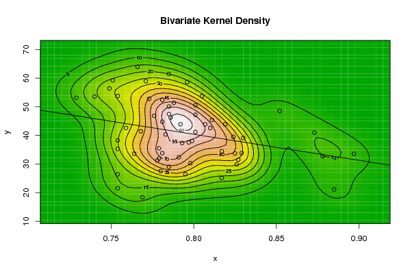
| Title produced by software | Bivariate Kernel Density Estimation | ||||||||||||||||||||||||||||||||||||||||||||
| Date of computation | Mon, 10 Nov 2008 10:00:38 -0700 | ||||||||||||||||||||||||||||||||||||||||||||
| Cite this page as follows | Statistical Computations at FreeStatistics.org, Office for Research Development and Education, URL https://freestatistics.org/blog/index.php?v=date/2008/Nov/10/t1226336482zxkor2y0g9r5w71.htm/, Retrieved Tue, 15 Jul 2025 02:07:49 +0000 | ||||||||||||||||||||||||||||||||||||||||||||
| Statistical Computations at FreeStatistics.org, Office for Research Development and Education, URL https://freestatistics.org/blog/index.php?pk=23140, Retrieved Tue, 15 Jul 2025 02:07:49 +0000 | |||||||||||||||||||||||||||||||||||||||||||||
| QR Codes: | |||||||||||||||||||||||||||||||||||||||||||||
|
| |||||||||||||||||||||||||||||||||||||||||||||
| Original text written by user: | |||||||||||||||||||||||||||||||||||||||||||||
| IsPrivate? | No (this computation is public) | ||||||||||||||||||||||||||||||||||||||||||||
| User-defined keywords | |||||||||||||||||||||||||||||||||||||||||||||
| Estimated Impact | 259 | ||||||||||||||||||||||||||||||||||||||||||||
Tree of Dependent Computations | |||||||||||||||||||||||||||||||||||||||||||||
| Family? (F = Feedback message, R = changed R code, M = changed R Module, P = changed Parameters, D = changed Data) | |||||||||||||||||||||||||||||||||||||||||||||
| F [Bivariate Kernel Density Estimation] [Bivariate Kernel ...] [2008-11-10 16:53:50] [819b576fab25b35cfda70f80599828ec] F D [Bivariate Kernel Density Estimation] [Bivaritae Kernel ...] [2008-11-10 16:58:43] [819b576fab25b35cfda70f80599828ec] F D [Bivariate Kernel Density Estimation] [Bivariate Kernel ...] [2008-11-10 17:00:38] [e08fee3874f3333d6b7a377a061b860d] [Current] - D [Bivariate Kernel Density Estimation] [paper 1.9 bivaria...] [2008-12-05 19:08:16] [819b576fab25b35cfda70f80599828ec] | |||||||||||||||||||||||||||||||||||||||||||||
| Feedback Forum | |||||||||||||||||||||||||||||||||||||||||||||
Post a new message | |||||||||||||||||||||||||||||||||||||||||||||
Dataset | |||||||||||||||||||||||||||||||||||||||||||||
| Dataseries X: | |||||||||||||||||||||||||||||||||||||||||||||
0.771 0.751 0.766 0.754 0.773 0.781 0.793 0.791 0.878 0.873 0.897 0.885 0.796 0.776 0.788 0.786 0.801 0.811 0.801 0.781 0.778 0.759 0.764 0.754 0.749 0.729 0.740 0.781 0.768 0.754 0.754 0.754 0.779 0.799 0.780 0.769 0.801 0.792 0.852 0.807 0.797 0.783 0.779 0.785 0.817 0.810 0.798 0.795 0.785 0.785 0.785 0.805 0.824 0.819 0.827 0.826 0.829 0.830 0.825 0.817 | |||||||||||||||||||||||||||||||||||||||||||||
| Dataseries Y: | |||||||||||||||||||||||||||||||||||||||||||||
58.972 59.249 63.955 53.785 52.760 44.795 37.348 32.370 32.717 40.974 33.591 21.124 58.608 46.865 51.378 46.235 47.206 45.382 41.227 33.795 31.295 42.625 33.625 21.538 56.421 53.152 53.536 52.408 41.454 38.271 35.306 26.414 31.917 38.030 27.534 18.387 50.556 43.901 48.572 43.899 37.532 40.357 35.489 29.027 34.485 42.598 30.306 26.451 47.460 50.104 61.465 53.726 39.477 43.895 31.481 29.896 33.842 39.120 33.702 25.094 | |||||||||||||||||||||||||||||||||||||||||||||
Tables (Output of Computation) | |||||||||||||||||||||||||||||||||||||||||||||
| |||||||||||||||||||||||||||||||||||||||||||||
Figures (Output of Computation) | |||||||||||||||||||||||||||||||||||||||||||||
Input Parameters & R Code | |||||||||||||||||||||||||||||||||||||||||||||
| Parameters (Session): | |||||||||||||||||||||||||||||||||||||||||||||
| par1 = 50 ; par2 = 50 ; par3 = 0 ; par4 = 0 ; par5 = 0 ; par6 = Y ; par7 = Y ; | |||||||||||||||||||||||||||||||||||||||||||||
| Parameters (R input): | |||||||||||||||||||||||||||||||||||||||||||||
| par1 = 50 ; par2 = 50 ; par3 = 0 ; par4 = 0 ; par5 = 0 ; par6 = Y ; par7 = Y ; | |||||||||||||||||||||||||||||||||||||||||||||
| R code (references can be found in the software module): | |||||||||||||||||||||||||||||||||||||||||||||
par1 <- as(par1,'numeric') | |||||||||||||||||||||||||||||||||||||||||||||