Free Statistics
of Irreproducible Research!
Description of Statistical Computation | |||||||||||||||||||||||||||||||||||||||||||||
|---|---|---|---|---|---|---|---|---|---|---|---|---|---|---|---|---|---|---|---|---|---|---|---|---|---|---|---|---|---|---|---|---|---|---|---|---|---|---|---|---|---|---|---|---|---|
| Author's title | |||||||||||||||||||||||||||||||||||||||||||||
| Author | *Unverified author* | ||||||||||||||||||||||||||||||||||||||||||||
| R Software Module | rwasp_bidensity.wasp | ||||||||||||||||||||||||||||||||||||||||||||
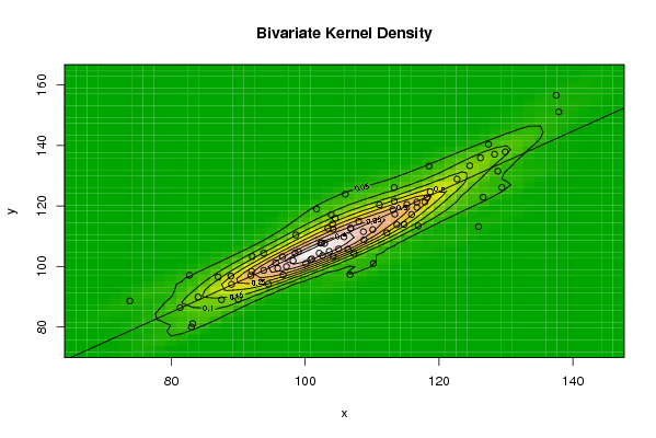
| Title produced by software | Bivariate Kernel Density Estimation | ||||||||||||||||||||||||||||||||||||||||||||
| Date of computation | Mon, 10 Nov 2008 05:03:44 -0700 | ||||||||||||||||||||||||||||||||||||||||||||
| Cite this page as follows | Statistical Computations at FreeStatistics.org, Office for Research Development and Education, URL https://freestatistics.org/blog/index.php?v=date/2008/Nov/10/t1226318700vtlnwculcn4hkrw.htm/, Retrieved Wed, 02 Jul 2025 04:09:43 +0000 | ||||||||||||||||||||||||||||||||||||||||||||
| Statistical Computations at FreeStatistics.org, Office for Research Development and Education, URL https://freestatistics.org/blog/index.php?pk=22978, Retrieved Wed, 02 Jul 2025 04:09:43 +0000 | |||||||||||||||||||||||||||||||||||||||||||||
| QR Codes: | |||||||||||||||||||||||||||||||||||||||||||||
|
| |||||||||||||||||||||||||||||||||||||||||||||
| Original text written by user: | |||||||||||||||||||||||||||||||||||||||||||||
| IsPrivate? | No (this computation is public) | ||||||||||||||||||||||||||||||||||||||||||||
| User-defined keywords | |||||||||||||||||||||||||||||||||||||||||||||
| Estimated Impact | 219 | ||||||||||||||||||||||||||||||||||||||||||||
Tree of Dependent Computations | |||||||||||||||||||||||||||||||||||||||||||||
| Family? (F = Feedback message, R = changed R code, M = changed R Module, P = changed Parameters, D = changed Data) | |||||||||||||||||||||||||||||||||||||||||||||
| F [Bivariate Kernel Density Estimation] [Bivariate Density...] [2008-11-10 12:03:44] [20dfa2578b2b18ce36fdb36ac12aedd7] [Current] | |||||||||||||||||||||||||||||||||||||||||||||
| Feedback Forum | |||||||||||||||||||||||||||||||||||||||||||||
Post a new message | |||||||||||||||||||||||||||||||||||||||||||||
Dataset | |||||||||||||||||||||||||||||||||||||||||||||
| Dataseries X: | |||||||||||||||||||||||||||||||||||||||||||||
106,7 110,2 125,9 100,1 106,4 114,8 81,3 87 104,2 108 105 94,5 92 95,9 108,8 103,4 102,1 110,1 83,2 82,7 106,8 113,7 102,5 96,6 92,1 95,6 102,3 98,6 98,2 104,5 84 73,8 103,9 106 97,2 102,6 89 93,8 116,7 106,8 98,5 118,7 90 91,9 113,3 113,1 104,1 108,7 96,7 101 116,9 105,8 99 129,4 83 88,9 115,9 104,2 113,4 112,2 100,8 107,3 126,6 102,9 117,9 128,8 87,5 93,8 122,7 126,2 124,6 116,7 115,2 111,1 129,9 113,3 118,5 137,9 103,6 101,7 127,4 137,5 128,3 118,2 | |||||||||||||||||||||||||||||||||||||||||||||
| Dataseries Y: | |||||||||||||||||||||||||||||||||||||||||||||
97,3 101 113,2 101 105,7 113,9 86,4 96,5 103,3 114,9 105,8 94,2 98,4 99,4 108,8 112,6 104,4 112,2 81,1 97,1 112,6 113,8 107,8 103,2 103,3 101,2 107,7 110,4 101,9 115,9 89,9 88,6 117,2 123,9 100 103,6 94,1 98,7 119,5 112,7 104,4 124,7 89,1 97 121,6 118,8 114 111,5 97,2 102,5 113,4 109,8 104,9 126,1 80 96,8 117,2 112,3 117,3 111,1 102,2 104,3 122,9 107,6 121,3 131,5 89 104,4 128,9 135,9 133,3 121,3 120,5 120,4 137,9 126,1 133,2 151,1 105 119 140,4 156,6 137,1 122,7 | |||||||||||||||||||||||||||||||||||||||||||||
Tables (Output of Computation) | |||||||||||||||||||||||||||||||||||||||||||||
| |||||||||||||||||||||||||||||||||||||||||||||
Figures (Output of Computation) | |||||||||||||||||||||||||||||||||||||||||||||
Input Parameters & R Code | |||||||||||||||||||||||||||||||||||||||||||||
| Parameters (Session): | |||||||||||||||||||||||||||||||||||||||||||||
| par1 = 50 ; par2 = 50 ; par3 = 0 ; par4 = 0 ; par5 = 0 ; par6 = Y ; par7 = Y ; | |||||||||||||||||||||||||||||||||||||||||||||
| Parameters (R input): | |||||||||||||||||||||||||||||||||||||||||||||
| par1 = 50 ; par2 = 50 ; par3 = 0 ; par4 = 0 ; par5 = 0 ; par6 = Y ; par7 = Y ; | |||||||||||||||||||||||||||||||||||||||||||||
| R code (references can be found in the software module): | |||||||||||||||||||||||||||||||||||||||||||||
par1 <- as(par1,'numeric') | |||||||||||||||||||||||||||||||||||||||||||||