Free Statistics
of Irreproducible Research!
Description of Statistical Computation | |||||||||||||||||||||||||||||||||||||||||||||
|---|---|---|---|---|---|---|---|---|---|---|---|---|---|---|---|---|---|---|---|---|---|---|---|---|---|---|---|---|---|---|---|---|---|---|---|---|---|---|---|---|---|---|---|---|---|
| Author's title | |||||||||||||||||||||||||||||||||||||||||||||
| Author | *The author of this computation has been verified* | ||||||||||||||||||||||||||||||||||||||||||||
| R Software Module | rwasp_bidensity.wasp | ||||||||||||||||||||||||||||||||||||||||||||
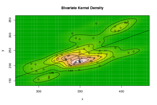
| Title produced by software | Bivariate Kernel Density Estimation | ||||||||||||||||||||||||||||||||||||||||||||
| Date of computation | Sun, 09 Nov 2008 10:47:04 -0700 | ||||||||||||||||||||||||||||||||||||||||||||
| Cite this page as follows | Statistical Computations at FreeStatistics.org, Office for Research Development and Education, URL https://freestatistics.org/blog/index.php?v=date/2008/Nov/09/t1226252858c8bfxhalij0qy5o.htm/, Retrieved Sun, 19 May 2024 10:49:55 +0000 | ||||||||||||||||||||||||||||||||||||||||||||
| Statistical Computations at FreeStatistics.org, Office for Research Development and Education, URL https://freestatistics.org/blog/index.php?pk=22796, Retrieved Sun, 19 May 2024 10:49:55 +0000 | |||||||||||||||||||||||||||||||||||||||||||||
| QR Codes: | |||||||||||||||||||||||||||||||||||||||||||||
|
| |||||||||||||||||||||||||||||||||||||||||||||
| Original text written by user: | |||||||||||||||||||||||||||||||||||||||||||||
| IsPrivate? | No (this computation is public) | ||||||||||||||||||||||||||||||||||||||||||||
| User-defined keywords | |||||||||||||||||||||||||||||||||||||||||||||
| Estimated Impact | 128 | ||||||||||||||||||||||||||||||||||||||||||||
Tree of Dependent Computations | |||||||||||||||||||||||||||||||||||||||||||||
| Family? (F = Feedback message, R = changed R code, M = changed R Module, P = changed Parameters, D = changed Data) | |||||||||||||||||||||||||||||||||||||||||||||
| F [Bivariate Kernel Density Estimation] [] [2008-11-09 17:47:04] [6d40a467de0f28bd2350f82ac9522c51] [Current] F RMPD [Partial Correlation] [] [2008-11-09 17:56:39] [4c8dfb519edec2da3492d7e6be9a5685] F RMPD [Trivariate Scatterplots] [] [2008-11-09 18:03:24] [4c8dfb519edec2da3492d7e6be9a5685] | |||||||||||||||||||||||||||||||||||||||||||||
| Feedback Forum | |||||||||||||||||||||||||||||||||||||||||||||
Post a new message | |||||||||||||||||||||||||||||||||||||||||||||
Dataset | |||||||||||||||||||||||||||||||||||||||||||||
| Dataseries X: | |||||||||||||||||||||||||||||||||||||||||||||
299,63 305,945 382,252 348,846 335,367 373,617 312,612 312,232 337,161 331,476 350,103 345,127 297,256 295,979 361,007 321,803 354,937 349,432 290,979 349,576 327,625 349,377 336,777 339,134 323,321 318,86 373,583 333,03 408,556 414,646 291,514 348,857 349,368 375,765 364,136 349,53 348,167 332,856 360,551 346,969 392,815 372,02 371,027 342,672 367,343 390,786 343,785 362,6 349,468 340,624 369,536 407,782 392,239 404,824 373,669 344,902 396,7 398,911 366,009 392,484 | |||||||||||||||||||||||||||||||||||||||||||||
| Dataseries Y: | |||||||||||||||||||||||||||||||||||||||||||||
154,783 187,646 237,863 215,54 231,745 199,548 164,147 159,388 203,514 224,901 211,539 211,16 181,712 203,908 240,774 232,819 255,221 246,7 206,263 211,679 236,601 237,43 233,767 219,52 222,625 216,238 248,587 221,376 242,453 246,539 189,351 185,956 213,175 228,732 212,93 218,254 227,103 219,026 264,529 262,057 258,779 231,928 211,167 205,439 224,883 228,624 209,435 215,607 287,356 306,015 338,546 344,16 328,412 342,006 277,668 290,477 314,967 324,627 290,646 315,033 | |||||||||||||||||||||||||||||||||||||||||||||
Tables (Output of Computation) | |||||||||||||||||||||||||||||||||||||||||||||
| |||||||||||||||||||||||||||||||||||||||||||||
Figures (Output of Computation) | |||||||||||||||||||||||||||||||||||||||||||||
Input Parameters & R Code | |||||||||||||||||||||||||||||||||||||||||||||
| Parameters (Session): | |||||||||||||||||||||||||||||||||||||||||||||
| par1 = 50 ; par2 = 50 ; par3 = 0 ; par4 = 0 ; par5 = 0 ; par6 = Y ; par7 = Y ; | |||||||||||||||||||||||||||||||||||||||||||||
| Parameters (R input): | |||||||||||||||||||||||||||||||||||||||||||||
| par1 = 50 ; par2 = 50 ; par3 = 0 ; par4 = 0 ; par5 = 0 ; par6 = Y ; par7 = Y ; | |||||||||||||||||||||||||||||||||||||||||||||
| R code (references can be found in the software module): | |||||||||||||||||||||||||||||||||||||||||||||
par1 <- as(par1,'numeric') | |||||||||||||||||||||||||||||||||||||||||||||